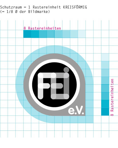
Corporate Design and logo development for “Forschungs- und Entwicklungsinstitut für Industrie- und Siedlungswasserwirtschaft sowie Abfallwirtschaft e.V. Stuttgart” (FEI).
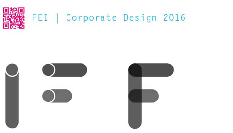
The most important topic for FEI researchers is liquid; including water and waste water. Hence, a simple icon of a tube became the leading design idea. By overlapping images of a couple of tube icons we created a special font to form the initials F, E and I. The form, grown out of the overlapped tubes in the corners of FEI, is iconic and will be used as the background container of the FEI Logo. Such a dead simple idea – we love it! The font that we used for the characters “e.V.” is VAG, which has a similar design approach as the FEI “tube” characters.
