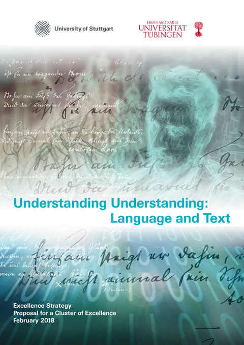
Title illustration and graphic design for “Understanding Understanding”, Universität Stuttgart / Universität Tübingen, Proposal for a Cluster of Excellence, Excellence Strategy 2018
Title illustration and graphic design for “Understanding Understanding”, Universität Stuttgart / Universität Tübingen, Proposal for a Cluster of Excellence, Excellence Strategy 2018
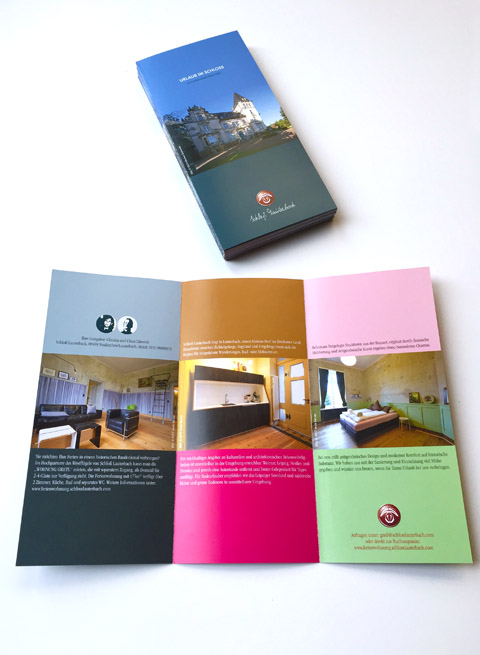
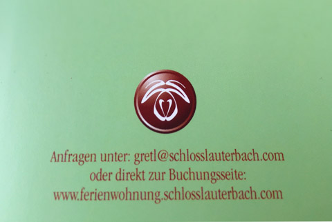
Fresh design for the sophisticated holiday retreat “Wohnung Gretl” at Schloss Lauterbach, Saxony. See more at www.ferienwohnung.schlosslauterbach.com
Starting a new business.
And we have been in charge to help with corporate stuff
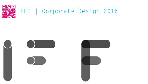
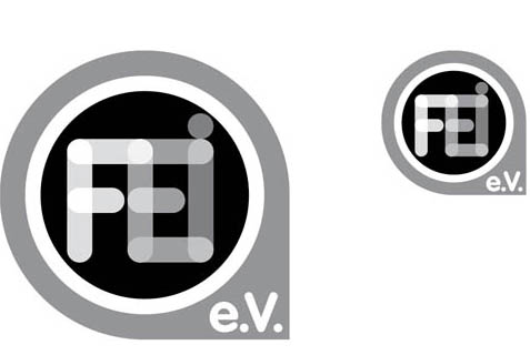
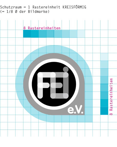
Corporate Design and logo development for “Forschungs- und Entwicklungsinstitut für Industrie- und Siedlungswasserwirtschaft sowie Abfallwirtschaft e.V. Stuttgart” (FEI).
The most important topic for FEI researchers is liquid; including water and waste water. Hence, a simple icon of a tube became the leading design idea. By overlapping images of a couple of tube icons we created a special font to form the initials F, E and I. The form, grown out of the overlapped tubes in the corners of FEI, is iconic and will be used as the background container of the FEI Logo. Such a dead simple idea – we love it! The font that we used for the characters “e.V.” is VAG, which has a similar design approach as the FEI “tube” characters.
Design of the new logo and corporate identity for “Welcome Dinner” for Department IV, a division of the Central Administration of the University of Stuttgart
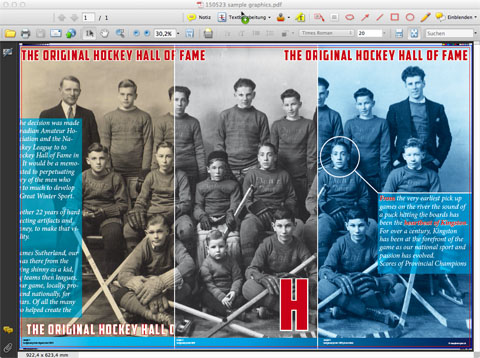
We have just started developing the graphics for the exhibition showing the members of the “Original Hockey Hall of Fame”, at the new museum in Kingston, Ontario Canada. This graphic is a sample of the back walls which will be printed on large brushed aluminum panels.
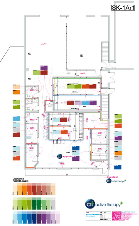
A new brand in Sudbury Ontario. We developed the floor plan of the treatment rooms, interior design details, overall colour concept and the new corporate design for a multi-disciplinary physical therapy clinic.
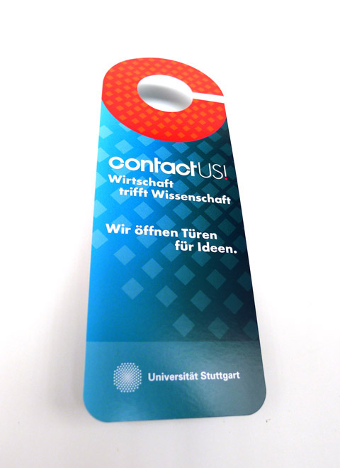
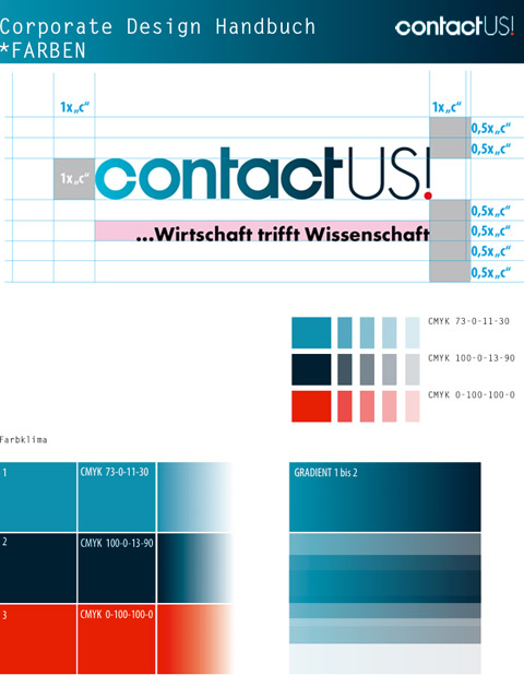
Logo development, corporate design and implementation of first print products for “contact US!” a department of the University of Stuttgart
Some thoughts about how to take a stand.
Just like individuals, every organisation, company or brand has its own identity. A distinct identity differentiates an organisation from its competitors. It allows customers, suppliers and staff to recognise, understand and clearly describe the organisation concerned. The identity of any organisation is complex. It includes the effectiveness of its services or products, the shared values and ambitions of its employees, the corporate tone of voice and PR profile. Naturally, its visual appearance (or visual identity) plays the key role.
Visual identity manifests itself in many ways. In addition to its logo, typeface and colours, the following all contribute to the impression created by the identity: stationery, marketing literature, buildings, interior design, signage, product design, customer information, vehicles and every aspect of promotional activity from a high-profile advertising campaign to the design of a giveaway.
The detailed management of a visual identity is equally important as the management of other business assets such as finance or human resources. Without a well thought out visual identity guideline, an organisation’s brand perception will be at best diluted, and at worse appear chaotic and unprofessional.
When all of the visual elements of an organisation work together in unity, the investment in its identity is protected and the overall image becomes one of quality and strength.
Short before official hours…
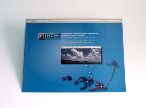
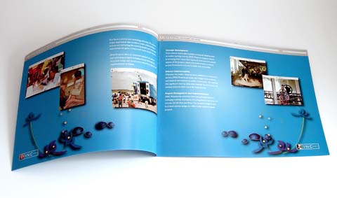
Design and artwork for the new ZINC Projects Image Brochure, 8 pages, letter landscape