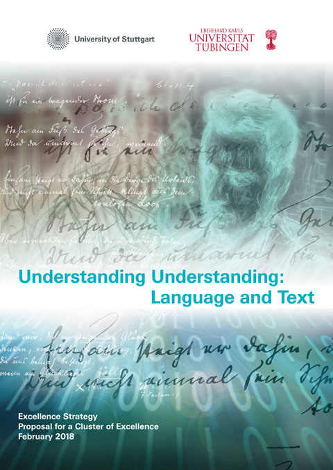
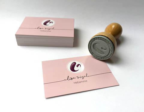
Title illustration and graphic design for “Understanding Understanding”, Universität Stuttgart / Universität Tübingen, Proposal for a Cluster of Excellence, Excellence Strategy 2018
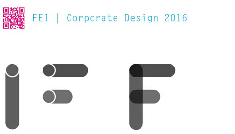
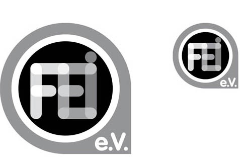
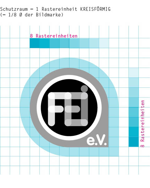
Corporate Design and logo development for “Forschungs- und Entwicklungsinstitut für Industrie- und Siedlungswasserwirtschaft sowie Abfallwirtschaft e.V. Stuttgart” (FEI).
The most important topic for FEI researchers is liquid; including water and waste water. Hence, a simple icon of a tube became the leading design idea. By overlapping images of a couple of tube icons we created a special font to form the initials F, E and I. The form, grown out of the overlapped tubes in the corners of FEI, is iconic and will be used as the background container of the FEI Logo. Such a dead simple idea – we love it! The font that we used for the characters “e.V.” is VAG, which has a similar design approach as the FEI “tube” characters.
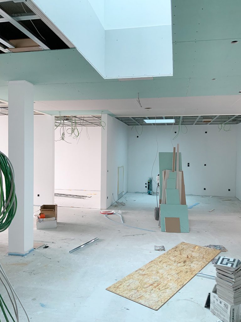
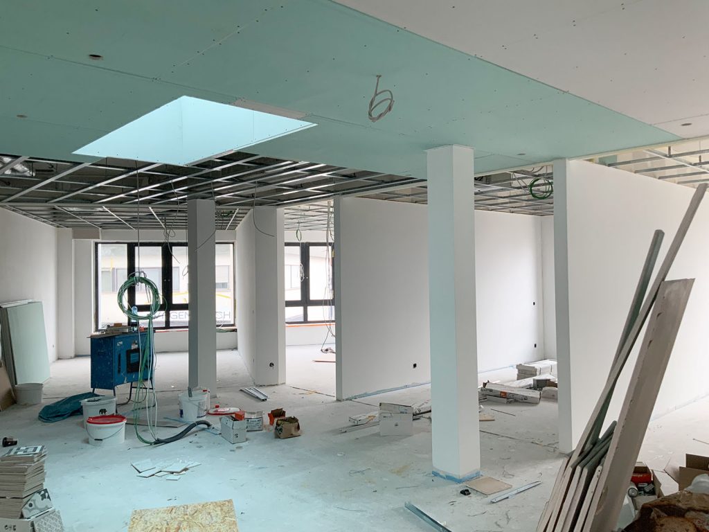
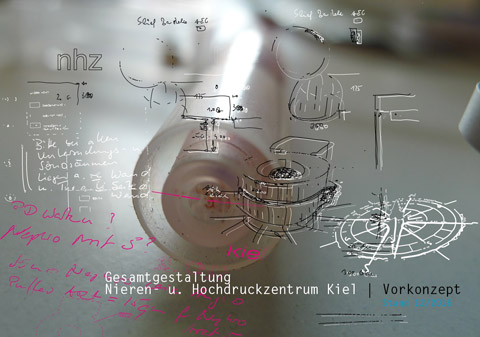
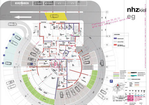
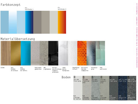
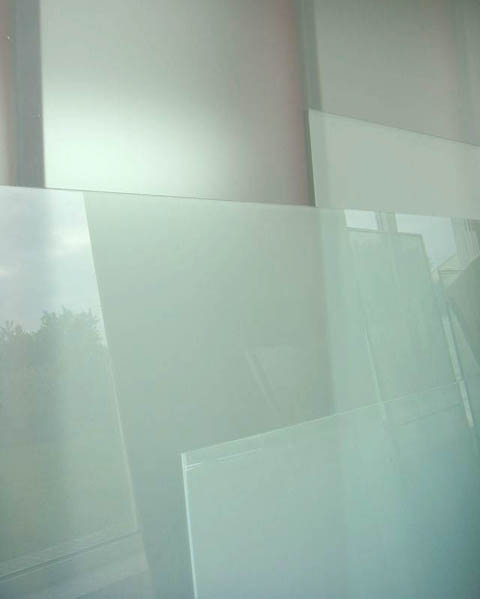
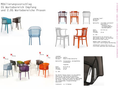
Interior design. This Pre-Concept of the ground floor was recently presented to the client “Nieren- und Hochdruckzentrum Kiel”. The site concept of this three story building on the campus of the Lubinus-Hospital will be prepared in spring 2017.
Design of the new logo and corporate identity for “Welcome Dinner” for Department IV, a division of the Central Administration of the University of Stuttgart
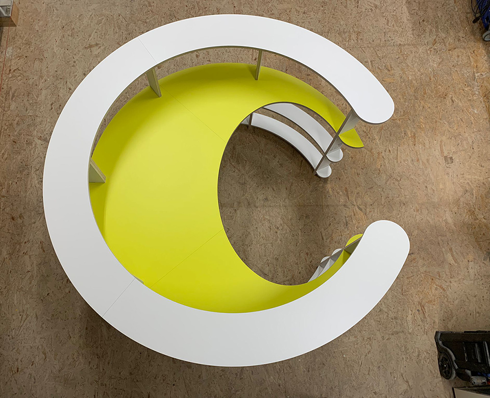
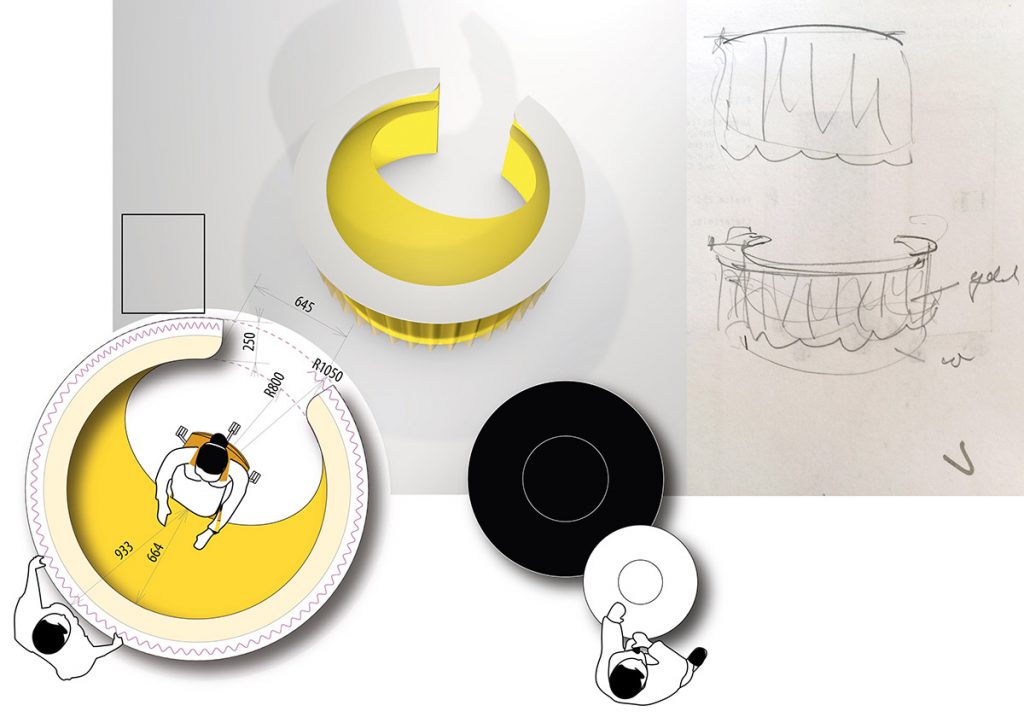
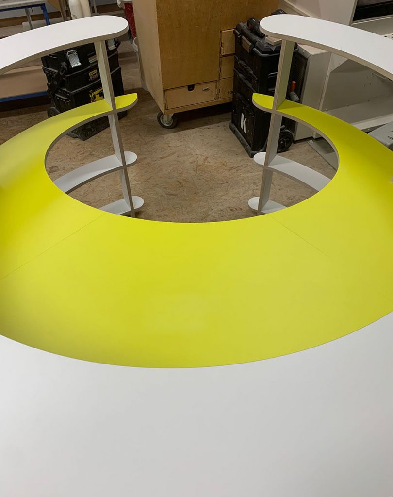
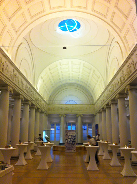
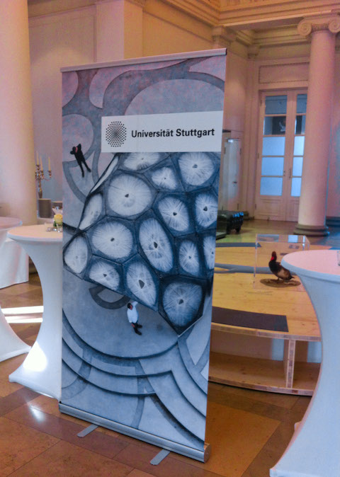
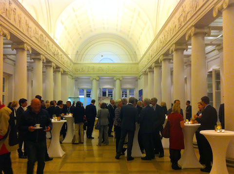
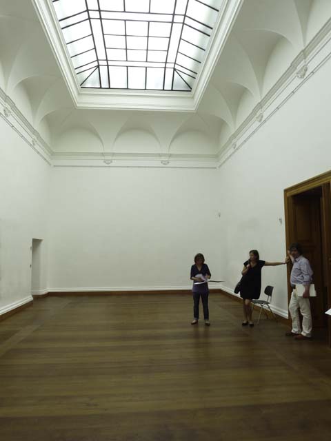
We were hired to design the graphics and to take part in the event planning for the spring reception of the “Wissenschaftsrat der Bundesrepublik Deutschland”. The reception was held by the University of Stuttgart. Location: the magnificent Schloss Rosenstein.
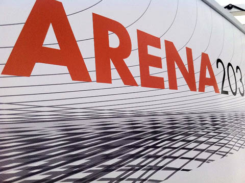
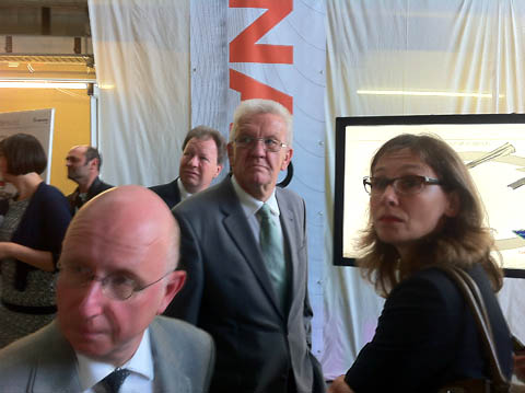
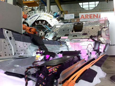
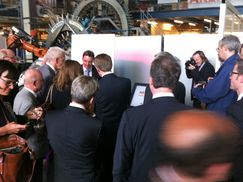
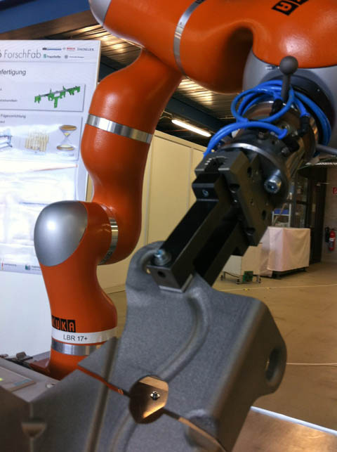
State Government, Science and Industry. How things definitely pick up speed! After designing the corporate identity for ARENA2036 earlier this year, we were then asked to plan and create the event celebrating of the incorporation of ARENA2036 in Stuttgart. ARENA2036 just might be the world´s most innovative joint venture: where both the design of the car of the future and its production methods, such as “knitting” bodies with robots, are brought together. The “meet and greet” event was held at a testing facility on the campus of Stuttgart University – more than 150 Vips of the Baden-Wurttemberg State Government, DLR, Fraunhofer Institute, University and industry representatives from Bosch, Daimler, Festo and others. We assisted with obtaining the planing permission and delivered the detailed exhibition design and graphics.
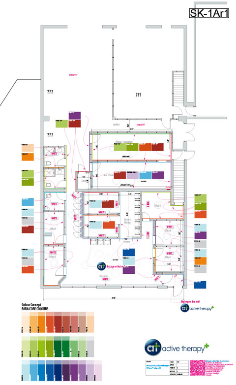
A new brand in Sudbury Ontario. We developed the floor plan of the treatment rooms, interior design details, overall colour concept and the new corporate design for a multi-disciplinary physical therapy clinic.
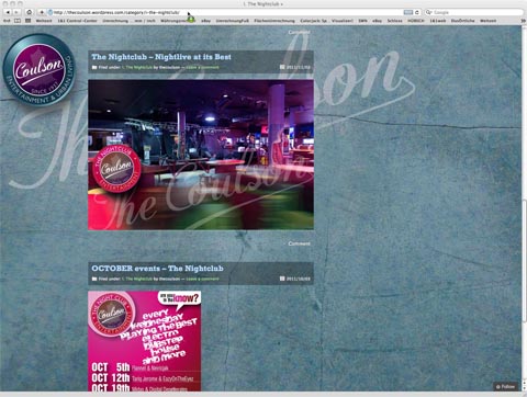
Along the Corporate Design guideline that we recently developed for the COULSON in Sudbury, CAN, a new website has been implemented. Key features: Marketing both, the rental apartments and the entertainment section with Nightclub, Bars and Restaurants. First time ever: A joint venture project, featuring 20 year old Carl Laemmle for art direction and coding.
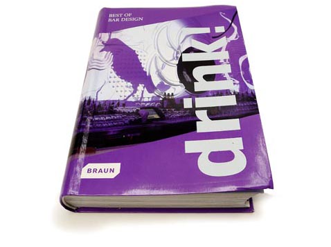
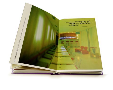
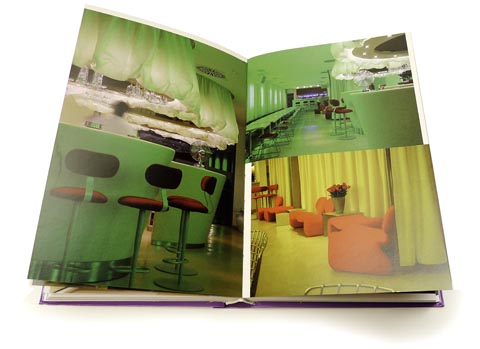
Unexpected honor for one of our past projects. BRAUN publishers have chosen the Hotel Drei Raben Lounge as “one of the best bars from all over the world” for the recently published book “DRINK! Best of Bar Design”. The selection comprises 41 bars, only 4 of them from Germany. Proud that ours is one of these and presented on 4 double-pages.
Title: “DRINK! Best of Bar Design” ISBN: 978-3-03768-015-5 / Publisher: BRAUN
400 pages / € 19.90
Preface: “The bar is the architectural embodiment of the night. Light, materials, forms and colors in the right mixture can become a kind of intoxicating cocktail in themselves. Drink! is an architectural excursion through the world’s most extraordinary bars.
Established architects and innovative young designers have created a unique atmosphere in each bar using off-beat, colorful interiors and minimalist, reduced design ideas. This volume presents contemporary trends in bar design in all their creative variety.