

New logo for the protestant parish of Besigheim
New logo for the protestant parish of Besigheim

new logo
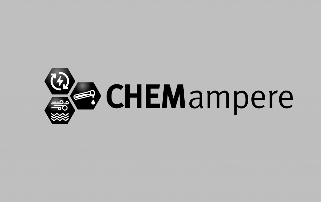
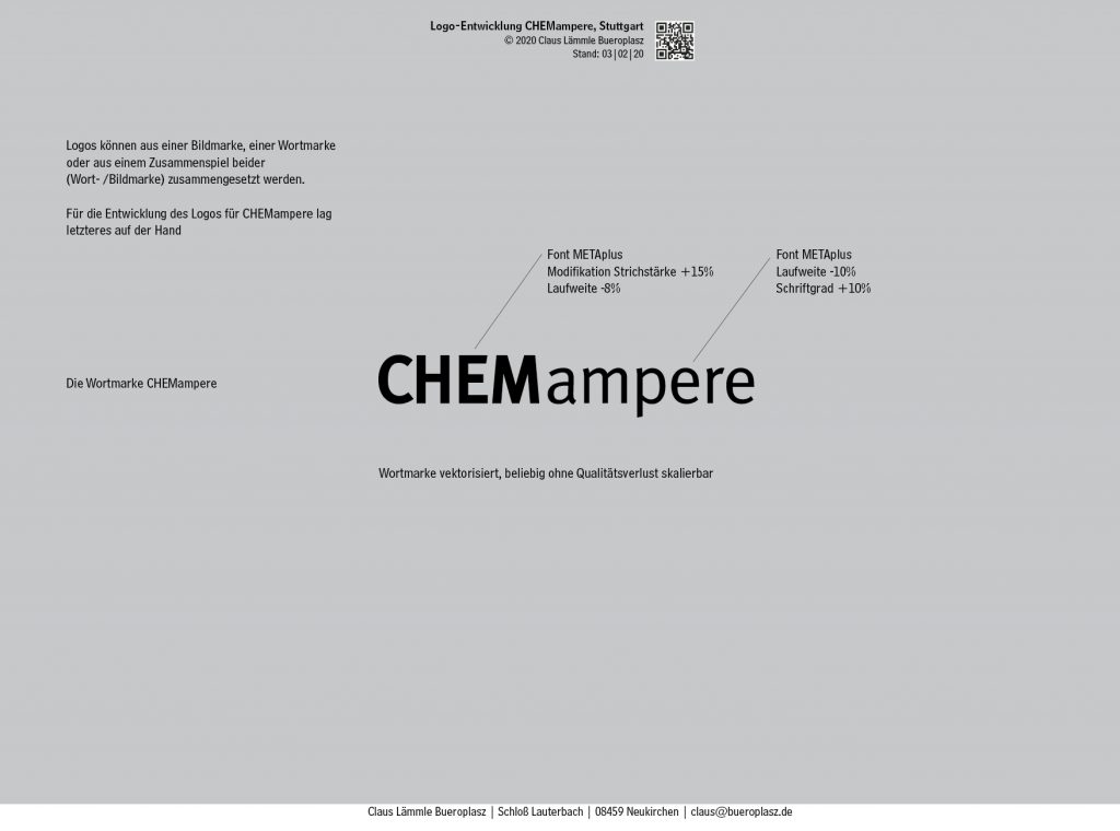
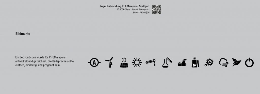
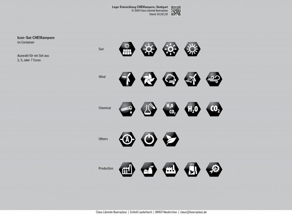
Sustainable Chemical Production with Electricity.
University of Stuttgart establishes research initiative CHEMampere. The concept of the new Stuttgart Research Initiative is based on the use of electricity from renewable sources, such as wind and solar, to activate the aforementioned ubiquitous non-fossil raw materials CO2, H2O, O2, and N2. The research initiative focuses on three electrical production technologies: Plasma Technology, Electrolytic Processes and Electrically Heated Reactors.
We have been working on corporate design issues and are currently designing the logo and a set of icons for CHEMampere
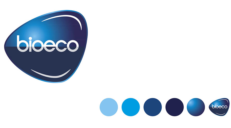
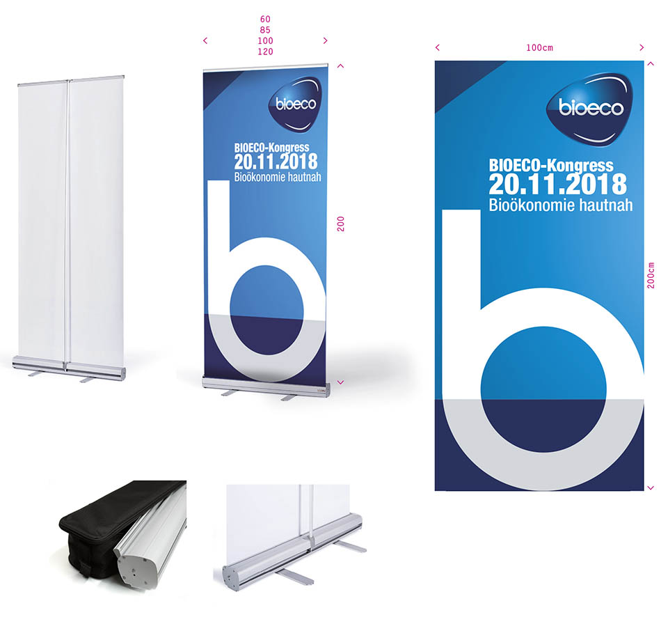
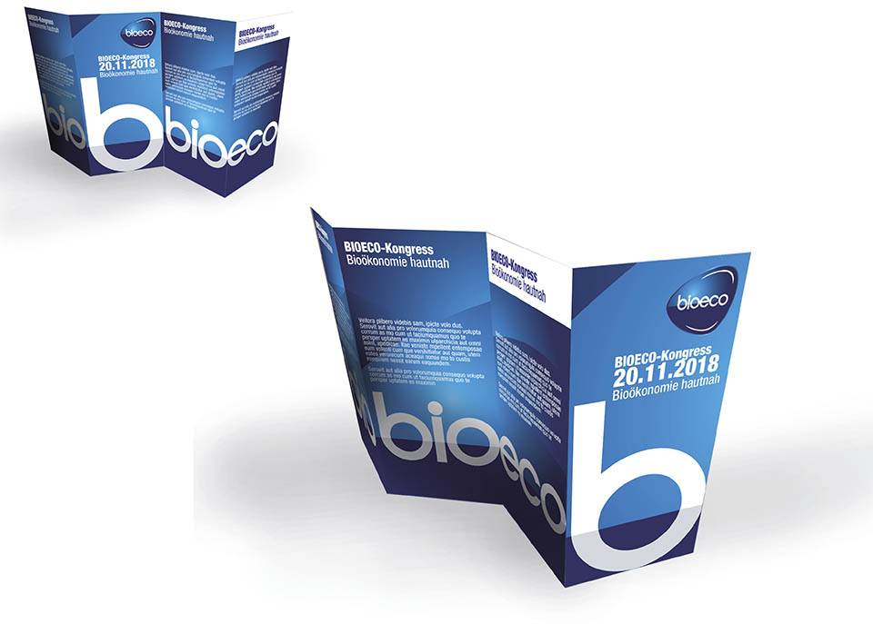
Corporate Identity für BioEco – Vorkonzept
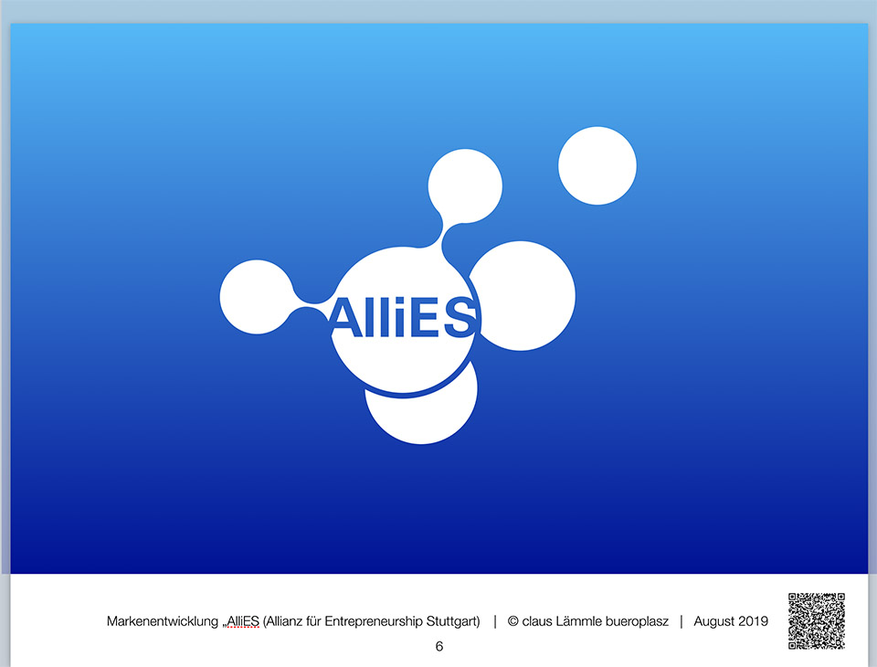

Entwicklung einer Wort- Bildmarke für AlliEs, Universität Stuttgart
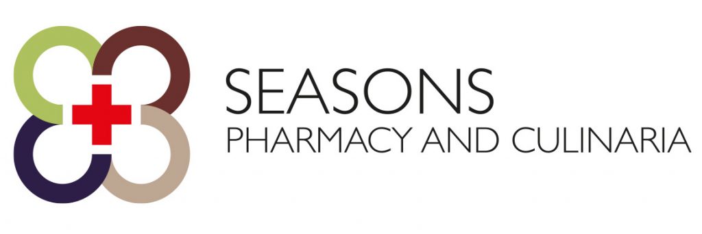
Development of the corporate identity of Seasons Pharmacy. More to come soon.

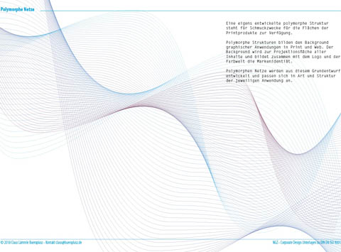
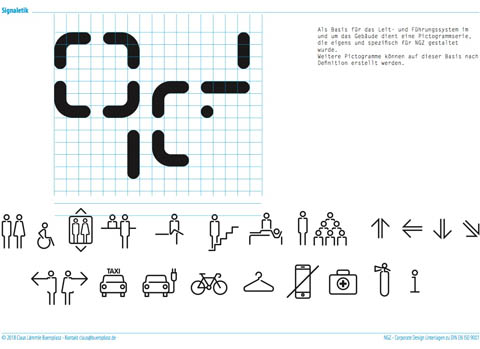
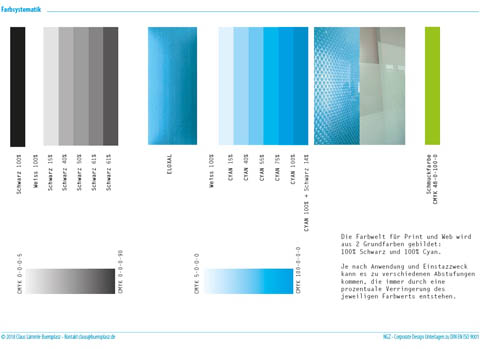

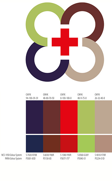
Working on the design development of the corporate design issues for our client NGZ-Kiel
Starting a new business.
And we have been in charge to help with corporate stuff
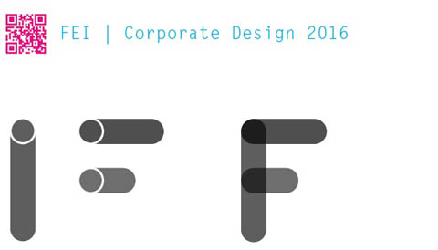
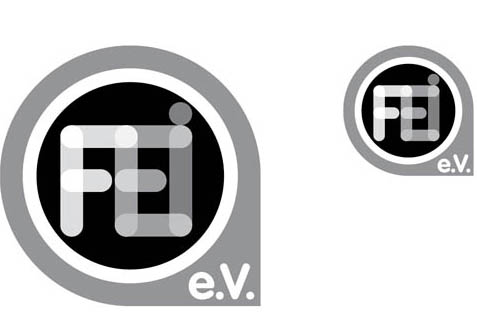
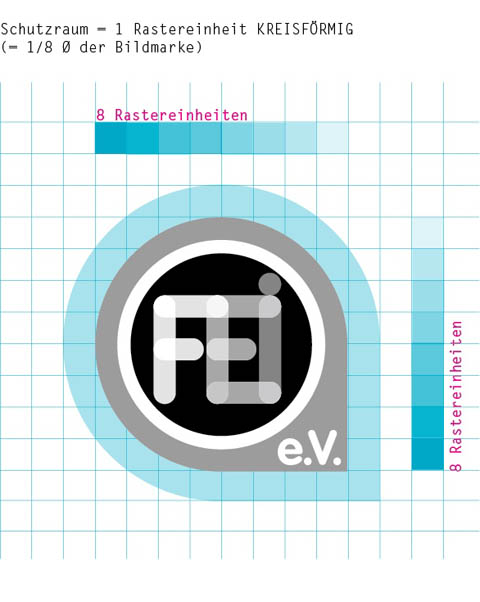
Corporate Design and logo development for “Forschungs- und Entwicklungsinstitut für Industrie- und Siedlungswasserwirtschaft sowie Abfallwirtschaft e.V. Stuttgart” (FEI).
The most important topic for FEI researchers is liquid; including water and waste water. Hence, a simple icon of a tube became the leading design idea. By overlapping images of a couple of tube icons we created a special font to form the initials F, E and I. The form, grown out of the overlapped tubes in the corners of FEI, is iconic and will be used as the background container of the FEI Logo. Such a dead simple idea – we love it! The font that we used for the characters “e.V.” is VAG, which has a similar design approach as the FEI “tube” characters.
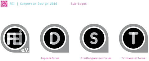
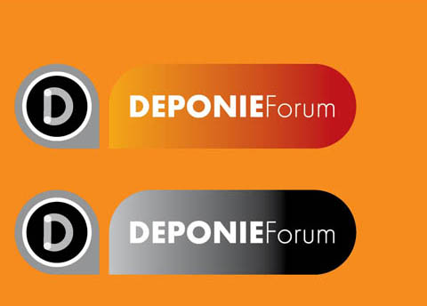
Design development for “Deponieforum” a yearly held event organised by the “Ministerium für Umwelt, Klima und Energiewirtschaft Baden-Württemberg” and “Universität Stuttgart, Lehrstuhl für Abfallwirtschaft und Abluft”

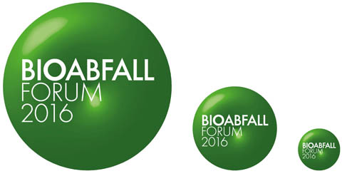
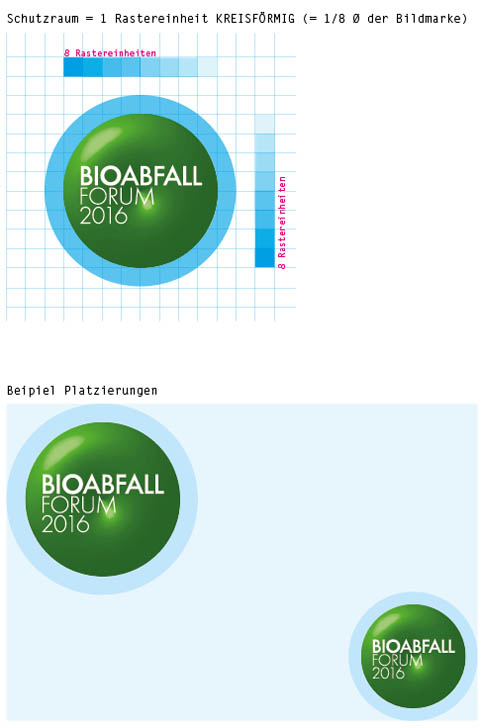
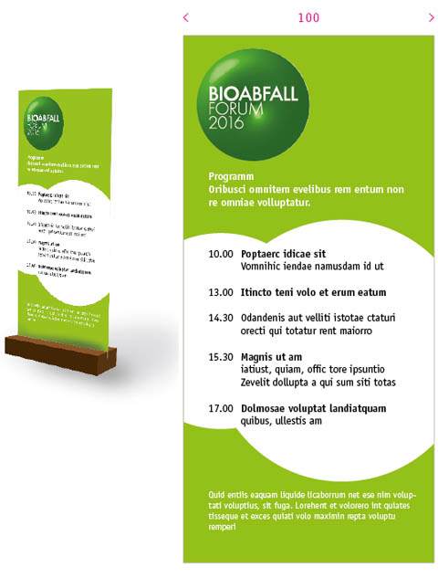
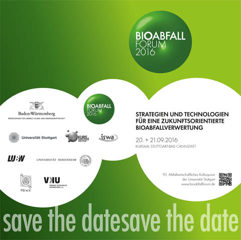
Working on the relaunch of the corporate identity of Bioabfallforum.
Design of the new logo and corporate identity for “Welcome Dinner” for Department IV, a division of the Central Administration of the University of Stuttgart


Brand and Logo Development for a joint venture of researchers on a cross-faculty and interdisciplinary basis at Stuttgart University, dealing with Nano Biology Materials.
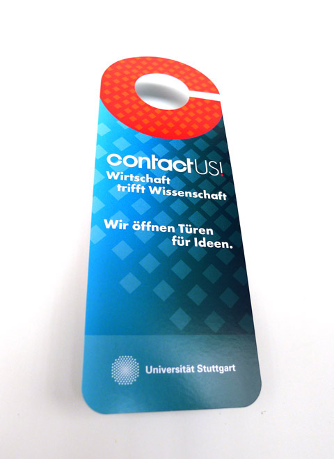
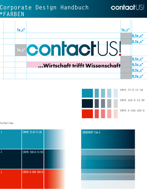
Logo development, corporate design and implementation of first print products for “contact US!” a department of the University of Stuttgart
![]()
![]()
Redevelopment of the Corporate Design of “Show Comunications” a design firm and good friends in Kingston, Ontario.
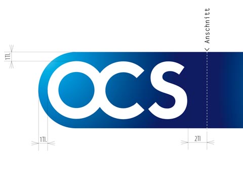
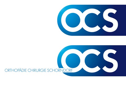
Logo-Entwicklung für ein Team von Orthopäden und Chirurgen mit gemeinsamer Praxis. Eröffnung Januar 2013.

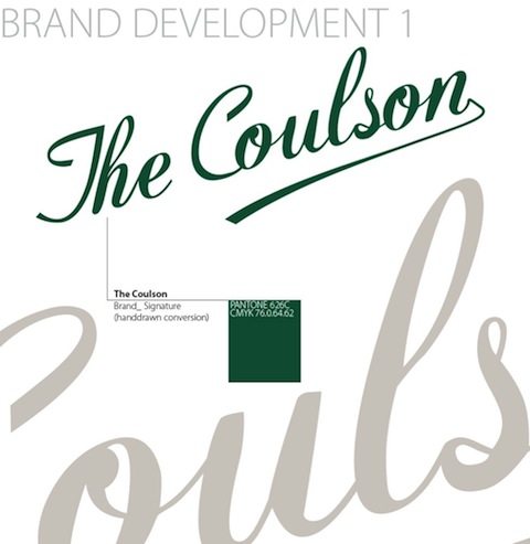
Logo development for a night club in Sudbury, Canada

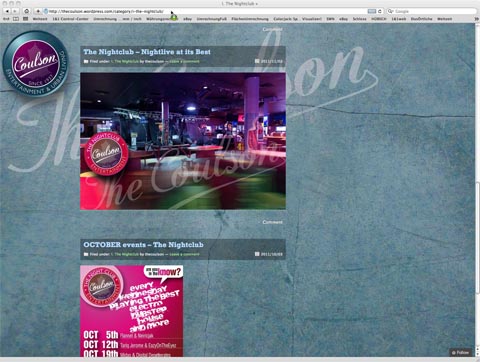
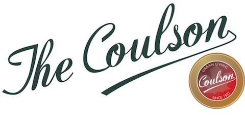
Along the Corporate Design guideline that we recently developed for the COULSON in Sudbury, CAN, a new website has been implemented. Key features: Marketing both, the rental apartments and the entertainment section with Nightclub, Bars and Restaurants. First time ever: A joint venture project, featuring 20 year old Carl Laemmle for art direction and coding.
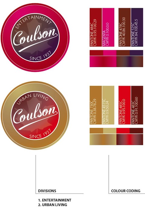
Currently we are working on the development of the Corporate Identity for the “COULSON Block”, Ontario CAN
Relaunch of the corporate identity of a Canadian dry cleaning business. We designed the company´s new logo, including a new color code, stationary and website

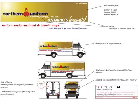
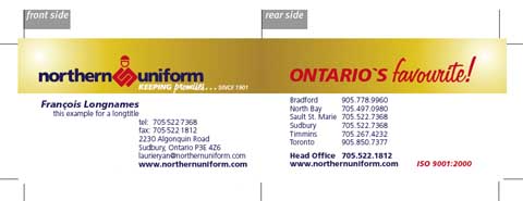
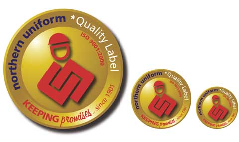
We redevelopped the Corporate Design for our client Northern Uniform, a big privately owned Canadian company providing premier uniform rental and dirt control solutions to companies all over Canada. The contract includes implementation of the new design for company vans, tractors & trailers, stationery, business cards, adds etc. A new color code was also part of the job
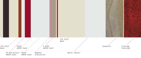
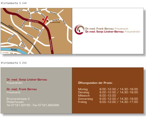
Corporate identity development for a medical practice. Job includes artwork for logo, guidance system, internet presence, graphic- and interior design, colour concept.
Entwicklung einer Corporate Identity für eine Arztpraxis. Bestandteile des Auftrags sind der Entwurf des Logos, Leitsystem, Graphik-Design, Gesamtgestaltung der Ausstattung und Farbkonzept.